
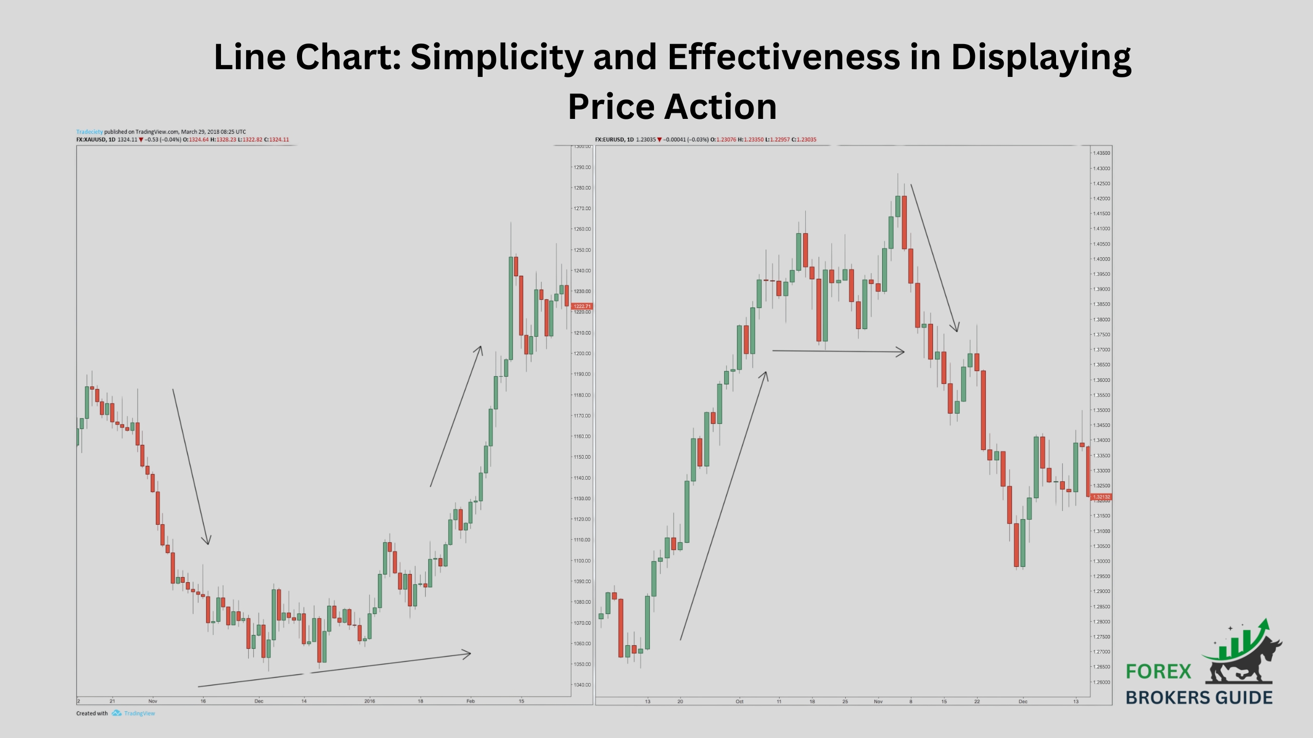
Line charts are a fundamental tool in the forex trader’s arsenal, offering a clear and concise way to visualize price action over time. Unlike bar charts that depict opening, closing, high, and low prices within a timeframe, line charts focus solely on the closing price. This simple approach results in a clean line connecting each closing price, creating a smooth representation of the price movement over the chosen period.
This simplicity is precisely what makes line charts so effective. By stripping away unnecessary details, line charts allow traders to focus on the overall trend and identify major turning points in the market. The uninterrupted flow of the line makes it easy to spot broad upward and downward trends, as well as potential support and resistance levels where the price might struggle to break through.
Table of Contents
What are Line Charts?
Line charts are a type of chart used in forex trading (and other financial markets) to visualize price movements over time. Unlike bar charts that show opening, high, low, and closing prices, line charts focus solely on the closing price for each time period. This results in a simple line connecting each closing price, offering a clear and concise view of the overall price trend.
How do they Represent Price Movements in Forex Trading?
Line charts are a staple tool in the forex trader’s toolbox, offering a clear and uncluttered way to visualize price movements over time. Unlike bar charts, which depict the entire range of price activity within a timeframe (open, high, low, close), line charts focus solely on the closing price for each interval. This translates to a single data point for each period, typically displayed as a dot or a small circle.
These closing price data points are then connected with straight lines, forming a continuous line that visually portrays the overall price movement. The slope of this line acts as a compass, indicating the trend direction. An upward slope suggests a price increase (uptrend), while a downward slope signifies a price decrease (downtrend).
One of the key strengths of line charts is their ability to filter out some of the “noise” associated with shorter timeframes. By excluding intraday price fluctuations (highs and lows), line charts allow traders to focus on the bigger picture – the overall trend direction and potential turning points in the market. This makes them ideal for technical analysis strategies that rely on identifying long-term trends and potential reversals.
Furthermore, line charts can be particularly useful for highlighting support and resistance levels. These are price zones where the price has historically struggled to break through. Since line charts depict the closing price, areas where the line encounters congestion or a change in direction can potentially indicate support or resistance levels. This visual representation allows traders to identify these key zones and make informed trading decisions based on price behavior around these levels.
How do Line Charts Simplify Price Action, highlighting Long-term Trends?
Line charts offer a breath of fresh air for forex traders seeking to simplify price action and identify long-term trends. Unlike bar charts that bombard you with details like opening, high, low, and closing prices for each timeframe, line charts focus solely on the closing price. This minimalist approach eliminates the “noise” of intraday fluctuations, allowing traders to see the forest through the trees – the overall direction of price movement over time.
Imagine line charts as a compass, guiding you towards the general course the price is taking. By connecting these closing prices with a continuous line, line charts create an uninterrupted visual representation of the trend. The slope of this line becomes the key indicator: an upward slope signifies a sustained increase in closing prices (uptrend), while a downward slope indicates a consistent decrease (downtrend).
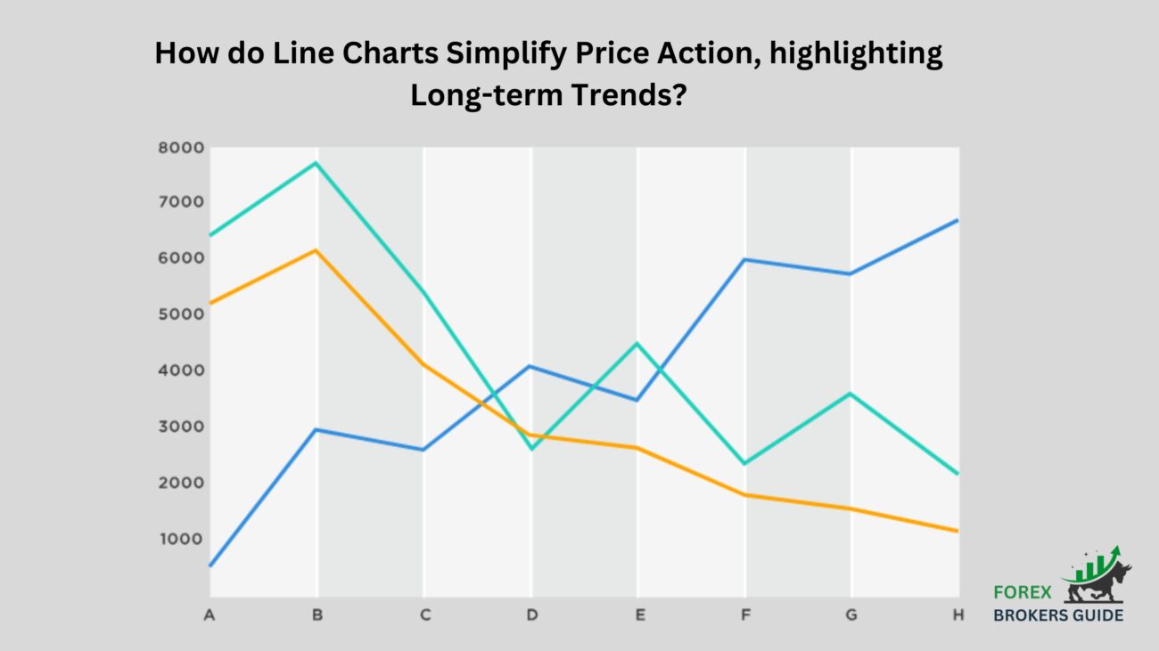
This simplified approach offers a clear advantage. By eliminating the clutter of intraday highs and lows, line charts allow traders to focus on the uninterrupted flow of closing prices, making it easier to identify long-term trends and potential trend reversals. Imagine a clear path emerging from the squiggly lines of a bar chart – that’s the power of line charts for trend analysis. For technical analysis strategies that rely on spotting long-term market direction, line charts become an invaluable tool. Their ability to simplify price action and highlight long-term trends allows traders to focus on the bigger picture and make strategic trading decisions with greater confidence.
When are Line Charts most Effective for Forex traders, compared to Other Chart Types?
Line charts shine brightest for forex traders in two key scenarios:
- Identifying Long-Term Trends: By focusing solely on closing prices and eliminating intraday noise, line charts excel at revealing long-term trends. The uninterrupted flow of the line makes it easy to spot sustained price increases (uptrends) or decreases (downtrends) over extended periods. This visual clarity is ideal for technical analysis strategies that rely on long-term trend direction for informed trading decisions.
- Spotting Potential Reversals: While not as detailed as bar charts, line charts can still provide clues about potential trend reversals. Areas where the line encounters congestion or changes direction can hint at support or resistance levels. If a long-term trend line encounters resistance and starts to reverse direction, it could signal a potential trend reversal.
However, for traders needing a more granular view of price action, other chart types like bar charts or candlesticks might be more suitable. These charts offer additional details like opening, high, low, and closing prices within a timeframe, which can be crucial for analyzing short-term volatility and making precise entry and exit decisions.
How can Forex Traders use Line Charts to Identify Potential Trend Reversals and Continuations?
Line charts, despite their seemingly simple appearance, can be a powerful tool for forex traders seeking to identify potential trend reversals and continuations. While they lack the intricate details of bar charts or candlesticks, line charts offer a unique perspective on price movements, allowing traders to spot the bigger picture and anticipate potential shifts in the market.
The key to leveraging line charts for trend analysis lies in a combination of techniques:
- Trend Line Analysis: The slope of the line itself is the first indicator. An upward sloping line signifies an uptrend, while a downward slope suggests a downtrend. The action of the line becomes particularly interesting when it encounters established support or resistance levels. If a trend line approaches a support level in a downtrend or a resistance level in an uptrend, it might signal a potential trend reversal. The line’s struggle to break through these levels can indicate a shift in market sentiment.
- Price Action at Key Levels: Line charts, in conjunction with other tools, can help identify support and resistance zones. These are price areas where the price has historically struggled to break through. Once these zones are identified, focus on how the price behaves around them. Does the price bounce off the support level in a downtrend, hinting at a potential reversal higher? Or does it break decisively through the resistance level in an uptrend, suggesting a continuation of the uptrend? Analyzing price action at these key junctures can provide valuable insights into the market’s next move.
- Divergence with Indicators: Sometimes, the price movements on the line chart might diverge from the movements of technical indicators displayed alongside it. For example, in an uptrend, if the line starts to flatten while a momentum indicator like the Relative Strength Index (RSI) remains high, it could suggest a weakening uptrend and a potential reversal. This divergence between price and indicator behavior can be a warning sign for a potential trend shift.
How do Moving Averages used on Line Charts help Confirm Trends and Generate Signals?
Moving averages (MAs) play a vital role in confirming trends and generating trading signals when used in conjunction with line charts in forex trading. By smoothing out price fluctuations on the line chart, MAs reveal the underlying trend direction. A consistently rising price above a rising MA strengthens the uptrend confirmation, while the opposite reinforces a downtrend. Furthermore, crossovers between shorter-term and longer-term MAs on the line chart can generate signals.
A bullish crossover (short-term MA above long-term MA) on an uptrend line suggests potential continuation, while a bearish crossover might indicate a reversal. Finally, how price interacts with the MA line itself is important. Support at the MA during a downtrend could signal a buying opportunity, while resistance during an uptrend might suggest a chance to sell. However, it’s important to remember that MAs on line charts are just one piece of the puzzle. Confirmation from other technical indicators and analysis remains crucial for making informed trading decisions.
What information Line Charts lack compared to more complex Chart Types?
Line charts, despite their clarity in showcasing price movements, have limitations compared to more complex chart types. They prioritize a simplified view by focusing solely on closing prices. This eliminates the valuable details captured by bar charts and candlesticks, such as intraday fluctuations, trading ranges, and specific price reversal patterns.
Firstly, line charts miss the “noise” of intraday price action. While this is helpful for identifying long-term trends, it can mask short-term volatility crucial for day traders or those seeking precise entry and exit points. Secondly, by connecting closing prices, line charts don’t depict the entire trading range for a period. This makes it difficult to pinpoint potential support and resistance zones, which are readily visualized by the open, high, low, and close bars in other chart types. Finally, line charts lack the detailed information provided by candlestick patterns.
These patterns, formed by the interplay of opening, high, low, and closing prices, offer more precise signals about potential trend reversals or continuations, which line charts can only hint at through changes in direction. In essence, line charts trade detailed information for simplicity, making them well-suited for understanding long-term trends but less ideal for short-term analysis or identifying specific trading opportunities.
How can Forex Traders use Line Charts effectively alongside other Technical Indicators?
Line charts, while effective for visualizing long-term trends in forex trading, truly shine when paired with other technical indicators. This collaboration unlocks a more powerful trading strategy. Line charts lay the groundwork by highlighting trends. Confirmation from technical indicators like moving averages adds confidence to these trend identifications. For instance, a consistently rising price above a rising moving average on the line chart strengthens uptrend confirmation.
Line charts can also suggest entry and exit zones, but for precise timing, other indicators come into play. The RSI can signal overbought or oversold conditions, hinting at potential trend reversals. Additionally, analyzing price action around support/resistance on the line chart with volume indicators helps gauge buying or selling pressure, potentially pinpointing stronger entry or exit points. By combining the strengths of line charts and other technical indicators, forex traders can craft a more robust and potentially successful trading strategy.
Can Line Charts be used to Identify Potential Support and Resistance Levels?
Line charts can be a helpful tool for identifying potential support and resistance levels in forex trading, although their effectiveness has limitations. Since they only depict closing prices, line charts lack the detailed picture provided by bar charts or candlesticks. However, they can still offer clues. Areas on the line chart where the price encounters congestion or bounces back and forth frequently might indicate zones of potential support or resistance.
These are areas where the price has historically faced buying or selling pressure. It’s important to remember that line charts provide a general idea. Confirmation from other tools like volume indicators on bar charts or other chart types is recommended for more precise identification of these key support and resistance levels.
How can Forex Traders use Line Chart Trends to develop Entry and Exit Points for Trades?
Line charts, with their focus on long-term trends, empower forex traders to develop entry and exit points for their trades. The first step is identifying the trend direction – an upward slope signifies an uptrend, while a downward slope indicates a downtrend. This paves the way for potential entry and exit zones. Line charts can also highlight areas where the trend encounters resistance or changes direction. These areas might be support zones in uptrends (where the price bounces) or resistance zones in downtrends (where the price struggles to break through). Confirmation comes from price action – does the price respect these zones?
A bounce off support in an uptrend suggests a potential buy, while a confirmed breakout above resistance in a downtrend might hint at a selling opportunity. It’s important to remember that line charts are just one piece of the puzzle. Combining trend analysis, support/resistance levels, and price action confirmation with other technical indicators helps refine entry and exit points, leading to a more robust trading strategy.
How dynamic Trendlines can be applied to Line Charts for Trend Analysis?
Static trendlines, drawn between two fixed points on a line chart, can be a helpful tool for forex traders. However, dynamic trendlines offer a more sophisticated approach to trend analysis.
Unlike their static counterparts, dynamic trendlines are not rigid lines. They adapt to changing price volatility using mathematical calculations like the Average True Range (ATR) to identify high volatility periods. These high volatility “candles” then define the trendline, making it more responsive to recent price movements. This adaptability offers several advantages:
- Enhanced Breakout and Support/Resistance Identification: By dynamically adjusting to volatility, trendlines can pinpoint potential breakouts from trends or support and resistance zones more effectively. A price consistently breaking above a rising dynamic trendline might signal a strong uptrend continuation, while a price consistently falling below a falling dynamic trendline could indicate a potential trend reversal.
- Multi-Timeframe Analysis: Dynamic trendlines can be applied to various timeframes on a line chart. This allows traders to analyze both short-term and long-term trends simultaneously. By observing how the trend behaves across different timeframes, traders can identify potential entry and exit points with greater confidence.
While line charts Lack Volume Data, how can Volume from Other Chart Types be used for Confirmation?
Line charts, while visually appealing, lack volume data – a key metric for confirming trends and identifying potential reversals. However, forex traders can leverage volume information from other chart types, like bar charts or candlesticks, to strengthen their analysis on the line chart.
For instance, a breakout on the line chart, where the price pushes above resistance in an uptrend or below support in a downtrend, gains significant weight if accompanied by high volume on the corresponding bar chart. This surge in volume suggests increased buying pressure (uptrend) or selling pressure (downtrend), bolstering the validity of the breakout.
Additionally, discrepancies between price movements on the line chart and volume on other charts can be revealing. If, for example, an uptrend on the line chart continues to push higher but volume on the bar chart starts to decline, it could be a sign of weakening momentum and a potential trend reversal in the making. By incorporating volume analysis from other charts alongside line charts, forex traders can gain valuable insights into trend strength and potential turning points in the market.
Although Less Prominent, can Specific Chart Patterns be identified on Line Charts?
Line charts, with their focus on simplicity, offer a clear view of price movements, but their limited detail can be a hurdle when it comes to identifying specific chart patterns. While not ideal, some basic patterns are still detectable, but with a caveat: confirmation from other sources is essential for reliable analysis.
For reversal patterns, look for potential head-and-shoulders formations on the line chart, where a peak (head) is followed by two lower peaks (shoulders). Similarly, double tops (two highs) and double bottoms (two lows) can be spotted. However, the lack of detailed price action data on line charts makes confirmation crucial. Elements like neckline breaks and volume levels, best observed on bar charts or candlesticks, are vital for validating these reversal patterns.
Line charts excel in depicting trends through trendlines that connect swing highs (uptrend) or swing lows (downtrend). These trendlines become particularly useful when breakouts occur. A price breaking above an uptrend line might signal a continuation of the uptrend, while a break below a downtrend line could hint at a reversal.
How can Line Charts be used alongside other Chart Types for a more comprehensive Market View?
Line charts, despite their simplicity, become true powerhouses when used in conjunction with other chart types in forex trading. This tag-team approach paints a more comprehensive picture of the market.
Line charts take center stage, providing a clear view of long-term trends through their uninterrupted flow. This initial analysis sets the foundation for further exploration with other chart types. Bar charts and candlesticks, with their detailed breakdowns of opening, high, low, and closing prices, can then refine the details. These more intricate charts pinpoint specific support and resistance zones, allowing for more precise identification of potential entry and exit points.
Finally, technical indicators displayed on other chart types add another layer of confirmation and signals. While line charts might suggest potential trend reversals or continuations based on slope changes, confirmation from indicators like moving averages or RSI on other charts strengthens the validity of these signals.
How to incorporate Line Chart Analysis into a Well-rounded Forex Trading Strategy?
Line charts, while seemingly simple, can be a powerful stepping stone in building a well-rounded forex trading strategy. Their strength lies in highlighting long-term trends. The first step is to analyze the line chart to understand the overall uptrend, downtrend, or consolidation phase. This initial trend identification sets the stage for your trading decisions.
However, line charts lack the detail to pinpoint precise entry and exit points. To refine your strategy, incorporate bar charts or candlesticks alongside the line chart. These charts, with their detailed price breakdowns, help you identify specific support and resistance zones.
Furthermore, confirmation from technical indicators displayed on other charts is crucial. Moving averages or RSI on bar charts can validate potential trend reversals, breakouts, or continuations suggested by the line chart’s slope changes. Finally, analyze how the price interacts with these key support and resistance levels on other charts. This price action analysis, combined with the line chart’s trend view, helps refine your entry and exit decisions.
Where can Forex Traders find Resources to improve their Line Chart Analysis Skills?
Forex traders seeking to sharpen their line chart analysis skills can leverage a wealth of online and educational resources. A first stop can be forex brokers themselves, many of whom offer educational sections on their websites. These sections often provide tutorials and articles specifically geared towards technical analysis and line chart techniques.
For a more structured learning experience, online trading academies offer comprehensive courses on forex trading. These courses frequently delve into the intricacies of technical analysis and line chart strategies. Financial news websites and educational YouTube channels can also be valuable assets. These platforms often publish articles and videos focused on technical analysis, with many featuring in-depth content on line chart usage and specific chart pattern identification.
Finally, classic trading books like “Technical Analysis of the Financial Markets” by John Murphy offer a timeless foundation. This book, and others like it, explore various chart types, including line charts, and the technical indicators that work best in conjunction with them. By actively utilizing these resources and practicing line chart analysis with real and historical data, forex traders can significantly improve their skills and gain valuable insights to inform their trading decisions. This combination of online resources, in-depth courses, and classic texts empowers traders to build a strong foundation in line chart analysis for successful forex market navigation.