
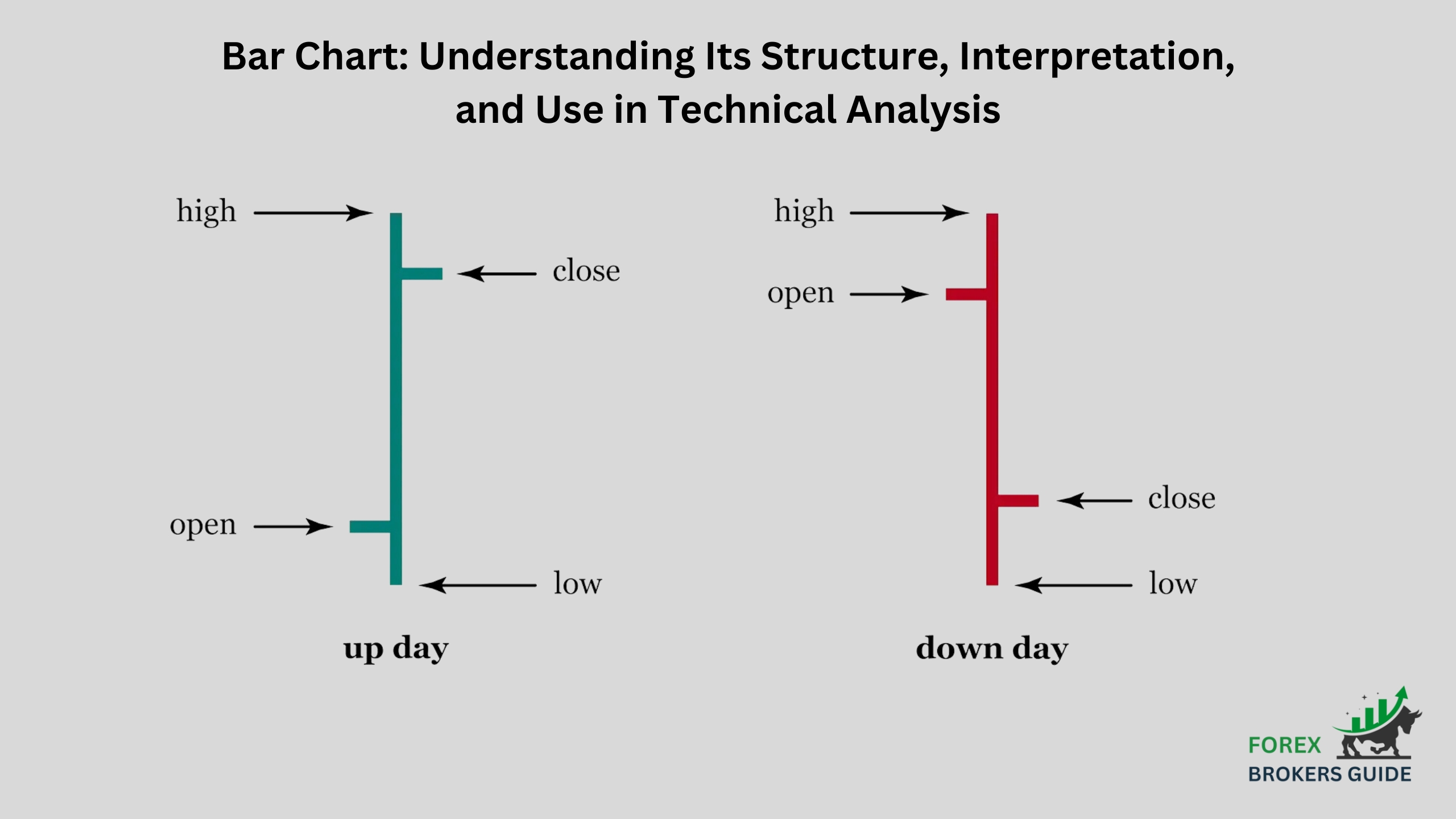
A bar chart, a foundational tool in technical analysis, offers a clear visualization of price movements for a security (stock, currency, commodity) over a chosen timeframe. While candlestick charts capture four data points (open, high, low, close), bar charts focus on the opening and closing prices within a specific period, which can range from minutes to months. Each bar acts as a mini-story, with its vertical line representing the price range for that timeframe. The left and right horizontal lines on the bar depict the opening and closing prices, respectively. The body’s length, the space between these lines, visually communicates the difference between the open and close.
Traditionally, a blue or green body extending upwards signifies a price increase (close higher than open), while a red or black body pointing downwards indicates a price decline (close lower than open). The body’s thickness is not just for aesthetics – it reflects the magnitude of the price movement. Finally, there’s more to a bar than meets the eye. The thin horizontal lines extending from the top and bottom of the body, known as tails or wicks, represent the highest and lowest prices reached within the timeframe. By analyzing the size, color, and position of these elements, technical analysts can glean valuable insights into trends, potential reversals, and areas of buying or selling pressure, ultimately informing their trading decisions.
Table of Contents
What are the Key Components of a Bar Chart in Forex Trading (open, high, low, close)?
Forex traders primarily rely on candlestick charts for their detailed price information. However, bar charts, despite their lack of comprehensiveness compared to candlesticks, can still be a valuable tool in the right hands. The key distinction lies in the information they convey.
In a bar chart, the focus is solely on the opening and closing prices of a currency pair within a specific timeframe, which can range from minutes to months. Each bar acts like a miniature story, with the left horizontal line representing the opening price and the right horizontal line signifying the closing price. The space between these lines, the body of the bar, visually communicates the difference between the open and close. Traditionally, a blue or green body extending upwards indicates a price increase (closing price higher than opening price), while a red or black body pointing downwards reflects a price decline (closing price lower than opening price).
While candlestick charts offer a more granular view by including the high and low prices reached within the timeframe, bar charts prioritize the relationship between open and close. This simplified approach can be useful for identifying trends and gauging overall market sentiment. By analyzing the size, color, and position of these elements, some traders can glean valuable insights and make informed decisions, even without the additional details provided by candlesticks.
How do bars Represent Price Movements within a Specific Timeframe?
Each bar acts as a window into a specific timeframe, which can range from minutes to months. By dissecting the key components of these bars, traders can extract valuable insights into price action.

The vertical line of the bar represents the entire price range experienced by the currency pair during that timeframe. Imagine a box drawn around the highest and lowest price reached within that period – the vertical line essentially depicts the height of that box. The left and right horizontal lines protruding from the vertical line hold particular significance. These represent the opening and closing prices, respectively. The position of these lines relative to each other unveils the price movement within the timeframe.
A longer space emerges between these lines if the price moved significantly during that period. This space forms the body of the bar, and its length visually communicates the extent of the price movement. A longer body translates to a larger difference between the open and close, signifying a more substantial price swing. Traditionally, the color of the body reflects the direction of the price movement. A blue or green body extending upwards signifies a price increase (closing price above opening price), while a red or black body pointing downwards reflects a price decline (closing price below opening price).
By analyzing these elements, forex traders can gain valuable insights. A series of bars with upward-pointing bodies suggests an uptrend, while a sequence of bars with downward-pointing bodies indicates a downtrend. The length of the vertical line, encompassing the entire price range, reflects intraday volatility. A longer line suggests a wider range of prices reached within the timeframe, indicating higher volatility. Finally, the size and color of the body can hint at market sentiment. A large bullish body (blue or green) might suggest strong buying pressure that pushed the price higher, while a large bearish body (red or black) could indicate selling pressure driving the price down.
What are the Strengths and Limitations of Bar charts compared to Other Chart Types?
Bar charts, while not the most sophisticated tool in a technical analyst’s toolbox, offer a unique balance of simplicity and practicality in forex trading. Here’s a breakdown of their strengths and limitations compared to other chart types, particularly candlestick charts:
Strengths of Bar Charts:
- Clear and Concise: Bar charts are visually clear and easy to understand. They focus solely on the opening and closing prices within a timeframe, making them ideal for beginners or those who prefer a less cluttered view.
- Trend Identification: Despite their simplicity, bar charts can still effectively identify trends. A series of bars with upward-pointing bodies suggests an uptrend, while a sequence with downward-pointing bodies indicates a downtrend.
- Volatility Assessment: The vertical line of the bar, encompassing the entire price range for the timeframe, reflects intraday volatility. A longer line suggests a wider range of prices reached, indicating higher volatility.
- Focus on Open and Close: For traders who prioritize understanding the open and closing prices within a timeframe, bar charts offer a direct view without the additional clutter of high and low prices seen in candlesticks.
Limitations of Bar Charts Compared to Candlesticks:
- Lack of Intraday Details: Unlike candlesticks that depict the high and low prices, bar charts only offer the opening and closing prices. This can be a disadvantage for traders who want a more comprehensive picture of price action within the timeframe.
- Limited Reversal Signal Identification: Certain candlestick patterns, like hammers or engulfing bars, offer valuable reversal signals. Since bar charts lack information on highs and lows, they might miss these subtle reversal cues.
- Potentially Less Informative Bodies: The size of the body in a bar chart reflects the difference between open and close, but it doesn’t necessarily tell the whole story. Without knowing the highs and lows, it’s difficult to gauge the intensity of buying or selling pressure behind the price movement.
How can Forex Traders use Bar Formations to Identify Potential Trends and Reversals?
Bar charts, despite their simplicity, empower forex traders to identify trends and potential reversals through specific formations. For trends, look for a series of bars with bodies consistently pointing in the same direction. Upward bodies suggest an uptrend, while downward bodies indicate a downtrend. To identify potential reversals, watch for engulfing bars that completely swallow the previous bar, island reversal bars with gaps above and below, or pin bars with long tails forming near support/resistance levels. Remember, these formations are clues, not guarantees. Always combine them with other technical analysis tools for a more confident trading approach.
What role does Bar Volume play in interpreting Price Action and Volatility?
Bar charts, though lacking a built-in volume indicator, can still be enhanced with additional information like volume bars. When available, volume plays a key role in interpreting price action and volatility. High volume coinciding with a large price movement (long bar body) strengthens the move’s significance, suggesting strong buying or selling pressure. Conversely, a surge in volume alongside a small bar or a reversal candlestick pattern (like a hammer) can be a stronger signal of a potential trend shift. High volume during reversals suggests increased market participation, possibly indicating a change in sentiment. By analyzing volume changes alongside price movements, traders can gain a better understanding of market volatility and the forces driving price action. Even without a dedicated volume indicator, experienced traders can sometimes estimate relative volume based on the bar body’s size and color. A larger, more intensely colored body might suggest a period of potentially higher volume compared to a smaller, paler one.
Are there Specific Bar Chart Patterns relevant to Technical Analysis in Forex?
While candlestick charts reign supreme in terms of technical analysis detail for forex traders, bar charts can still be useful with specific formations. The key here is focusing on the relationship between opening and closing prices within a timeframe.
One such formation is the engulfing bar. Imagine a large bar that completely swallows the body and wicks of the previous bar. A bullish engulfing bar suggests a potential reversal upwards, while a bearish engulfing bar indicates a possible reversal downwards. Essentially, the engulfing bar signifies a shift in dominance between buyers and sellers.
Another interesting formation is the island reversal bar. This bar appears isolated from its neighbors, with a gap above and below its body. This isolation can hint at a potential turning point in the market.
Finally, pin bars offer clues about reversals. These bars have a very small body and a long tail extending in one direction. An upward pin bar might suggest a potential downtrend reversal, while a downward pin bar could hint at a potential uptrend reversal. The location of these pin bars near support or resistance levels strengthens the reversal signal.
How can Forex Traders use Bar Charts alongside other Technical Indicators for Confirmation?
Bar charts, while lacking the intricate details of their candlestick cousins, still hold significant value in the forex trader’s toolbox. Their strength lies in their clarity, making them ideal for use alongside other technical indicators to achieve confirmation bias. This collaborative approach strengthens trading signals and fosters a more informed decision-making process.
One way bar charts and technical indicators work together is through price action confirmation. Bar charts excel at highlighting trends. A series of bars with consistently upward-pointing bodies becomes even more convincing when supported by a technical indicator like a moving average that slopes upwards in tandem. Conversely, downtrending bars with downward-pointing bodies gain weight when confirmed by a downward sloping moving average.
Similarly, bar formations like engulfing bars or pin bars can hint at potential trend reversals. However, the true test lies in confirmation from technical indicators. The relative strength index (RSI) or the stochastic oscillator, for example, can significantly bolster the validity of these signals. When these indicators reach overbought or oversold levels, respectively, and coincide with a potential reversal bar on the chart, the reversal signal becomes much more trustworthy.
Beyond price action, bar charts can also be used in conjunction with technical indicators to assess market volatility. Bar charts with large bodies and high volume (if available) suggest a period of strong buying or selling pressure, potentially indicating increased volatility. This can be further confirmed by technical indicators like the Average True Range (ATR), which measures historical volatility. A rising ATR alongside large bar movements strengthens the signal of heightened volatility.
The key takeaway is to avoid relying on a single indicator for confirmation. By incorporating multiple indicators alongside bar charts, traders can create a more robust trading strategy. Imagine a bullish engulfing bar on the chart supported by an RSI value exiting oversold territory and a MACD crossover to the upside – this confluence suggests a potential buying opportunity with a higher degree of confidence.
How can Forex Traders use Bar Formations to Develop Entry and Exit Points for trades?
While bar charts themselves may seem simple, they can be surprisingly helpful for forex traders seeking entry and exit points for their trades. By recognizing key bar formations, traders can make more informed decisions.
For example, a breakout bar decisively breaking above resistance in an uptrend (ideally with high volume) can signal a potential entry point to buy in the direction of the breakout. Similarly, continuation bars within an established trend, where the bar body furthers the trend (upward body in uptrend, downward body in downtrend), can be potential entry points, especially during pullbacks or retracements within the trend.
Spotting reversal opportunities is also possible with bar formations. Engulfing bars, large bars that completely engulf the previous bar’s body and wicks, can signal a potential reversal entry. A bullish engulfing bar near support suggests a possible long entry (buying), while a bearish engulfing bar near resistance suggests a potential short entry (selling). Island reversal bars, isolated bars with gaps above and below, might also hint at a reversal point, especially near support or resistance, offering potential entry points for reversal trades.
Bar formations can even be used to manage exits. Once in a trade, subsequent bar formations can suggest profit targets. For instance, in a long trade (buying), a large bearish reversal bar might indicate a good time to exit and lock in profits. Stop-loss placement can also be informed by bar formations. In a long trade, a stop-loss could be placed below a swing low (represented by the bottom of a bar) following the entry point.
How to effectively Combine Bar Charts with Other Chart Types like Candlesticks?
Forex traders can leverage the strengths of both bar charts and candlesticks by using them together. Bar charts shine in highlighting trends and volatility with their focus on opening and closing prices. Candlesticks, on the other hand, offer a more detailed picture with information on highs and lows within a timeframe, which helps identify reversal signals and market sentiment. This complementary approach allows traders to capitalize on the advantages of each chart type.
One way to combine them is through a confirmation strategy. A trader might use bar formations on the bar chart to spot potential trend continuations or reversals (like breakouts or engulfing bars). They can then look for confirmation on the candlestick chart. For example, a bullish engulfing bar on the bar chart might find validation from a bullish hammer candlestick pattern, significantly strengthening the potential trend reversal signal.
Bar charts can also benefit from the additional information candlesticks provide. Since bar charts can generate false signals due to their simplicity, using them alongside candlesticks can help filter out some of this noise. The extra details from candlesticks can help traders identify potentially misleading formations on the bar chart.
Finally, this combination can be helpful for pinpointing entry and exit points. While bar charts offer general zones for entering or exiting trades, candlestick patterns can provide more precise timing signals. Imagine a breakout bar on a bar chart suggesting a potential long entry. A confirmation breakout pattern on the candlestick chart (like a bullish breakout bar with higher volume) can refine that suggestion into a more specific entry point.
How can Fundamental Factors and Market News impact Price Movements visualized in Bar Charts?
Economic data releases can significantly influence price action. Strong economic data might trigger a surge in buying pressure, causing the price to close significantly higher than the open on the bar chart, potentially forming a long bar body. This visually reflects increased optimism and translates to an upward price movement. Conversely, weak economic data could lead to selling pressure, resulting in a bar with a short body or a close much lower than the open, potentially signifying a bearish move as investors lose confidence.
Geopolitical events can also leave their mark on bar charts. Geopolitical tensions or instability can spook investors, leading to increased selling pressure reflected in a series of bars with downward-pointing bodies. The market’s fear translates into a price decline visualized on the chart. Conversely, positive geopolitical developments might boost investor confidence, potentially translating into bars with upward-pointing bodies. Here, the chart reflects a shift in sentiment towards optimism, potentially causing a price increase.
Central bank policy announcements are another key factor that can impact price movements. Interest rate hikes by central banks can strengthen a currency, potentially reflected in bar charts by a series of bars with bullish closes. This visually represents increased demand for the currency as investors seek higher returns. Conversely, interest rate cuts could weaken a currency, potentially visualized by bars with bearish closes. The chart reflects a decline in investor confidence in the currency, leading to a potential price decrease.
How to Incorporate Bar Chart Analysis into a Well-rounded Forex Trading Strategy?
While bar charts offer a clear and concise view of price movements, they shouldn’t be the sole foundation of a forex trading strategy. Here’s how to effectively integrate bar chart analysis into a more comprehensive approach:
1. Leverage Trend Clarity: Bar charts excel at highlighting trends. Look for a series of bars with consistently pointing bodies – upward bodies for uptrends and downward bodies for downtrends. This initial analysis using bar charts sets the stage for your trading decisions. By identifying the overall trend direction, you can make informed choices about whether to buy or sell a currency pair.
2. Seek Confirmation Beyond Bars: Don’t fall prey to the allure of a single bar formation. Always seek confirmation from technical indicators like moving averages or the RSI (Relative Strength Index). These indicators can validate potential trend continuations or reversals identified on the bar chart. Confirmation from technical indicators adds another layer of confidence to your trading strategy, reducing the risk of impulsive decisions based solely on bar formations.
3. Gauge Market Volatility with Bar Size and Volume: The size of the bar and, if available, the volume within the bar, can offer valuable insights into market volatility. Large bars with high volume suggest periods of heightened activity, potentially indicating strong buying or selling pressure. Understanding market volatility is crucial for informed risk management decisions. During periods of high volatility, you might choose to adopt a more conservative trading approach or adjust your stop-loss levels.
4. Refine Entry and Exit Points with Additional Tools: While bar formations can hint at potential entry and exit zones, consider combining them with other technical tools for more precise timing signals. Look for price action at support/resistance levels or specific candlestick patterns that reinforce the signals from the bar chart. This multi-pronged approach can help you pinpoint the exact moment to enter or exit a trade, potentially improving your overall trade execution and profitability.
5. Don’t Isolate Technicals – Consider Fundamentals: Remember, technical analysis, including bar charts, reflects market sentiment in response to fundamental factors. Stay informed about economic data releases, geopolitical events, and central bank pronouncements. These factors can significantly impact price movements visualized on the bar chart. By incorporating fundamental analysis alongside technical analysis, you create a well-rounded trading approach that considers both short-term technical signals and the broader economic landscape, ultimately leading to more informed and potentially successful trades.
Line Chart: Simplicity and Effectiveness in Displaying Price Action
30 May 2024[…] toolbox, offering a clear and uncluttered way to visualize price movements over time. Unlike bar charts, which depict the entire range of price activity within a timeframe (open, high, low, close), line […]